Squeeze pages — What are they and how should I use them?
Here at Spring Insight, we have had a lot of fun this summer creating some new and marketing campaigns. With each campaign, we have created a squeeze page to send audiences to. I haven’t talked about squeeze pages on this blog.
First things first, what is a squeeze page?
A squeeze page is a page designed to elicit ONE action from visitors. It is typically used to drive sign-ups of some sort. Take a look at a squeeze page our marketing team recently designed to drive sign-ups for web assessments.
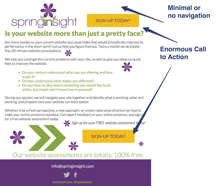
This is a pretty typical squeeze page in that it has HUGE sign-up buttons and very little other navigation. This is really important because you want to draw the user’s eye toward the opt-in button. The use of color here is really strategic too: the bright yellow really catches users’ attention. The one and only purpose of this page is to get someone to sign-up for a web assessment.
Another great point to make about this squeeze page is it’s short and gets right to the point. I’ve seen some really, really long squeeze pages and it somewhat defeats it’s intended purpose.
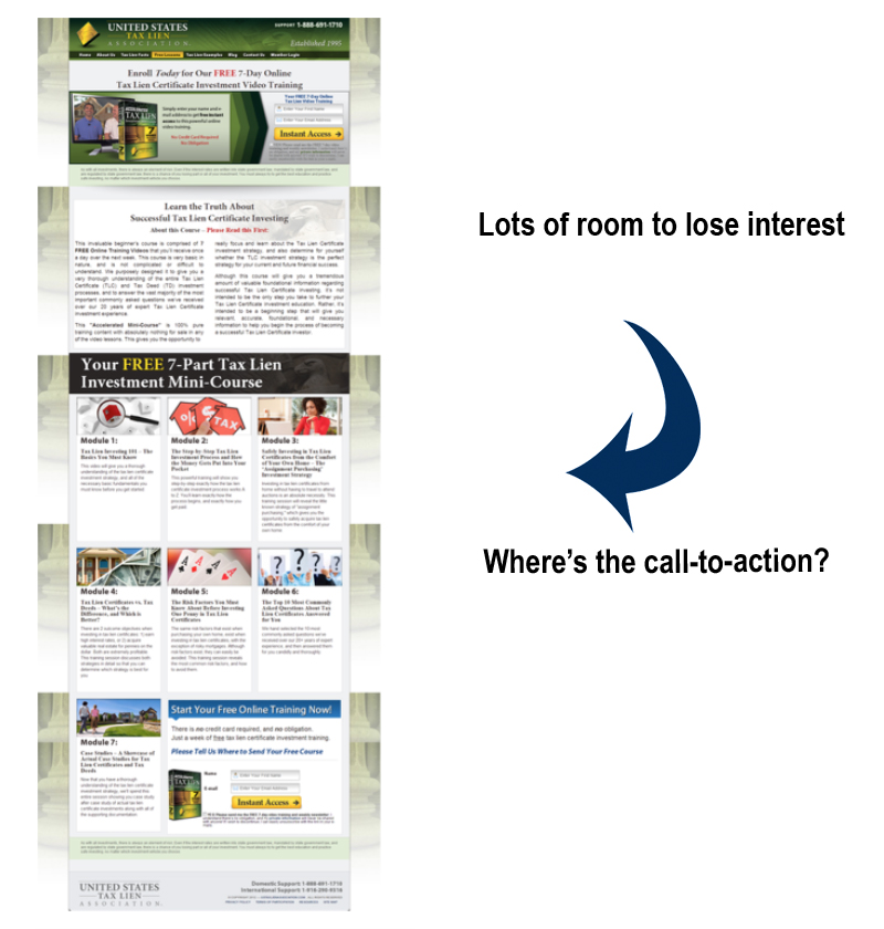
It’s important to keep the scrolling to a minimum. You have roughly 30-seconds to keep the interest of your prospective client. The last thing you want is a visitor losing interest before they click on the call-to-action.
The best thing about squeeze pages from a business perspective is they are easy to create (we use Instapage, which has a WordPress plugin as a shortcut), so you can customize them for different campaigns. This makes tracking success metrics easier and you can customize the language to fit your target audience.
My one caveat… squeeze pages have NO place in your navigation. Like the cheese in “The Farmer in the Dell,” (Heigh-ho the, derry-o? What does that even mean?) squeeze pages should stand alone. The reasoning behind this is when your visitor leaves the navigational structures within the squeeze page, they receive a broken experience.