5 Common Home Page Mistakes Small Businesses Make
 1. They aren’t giving me a next step
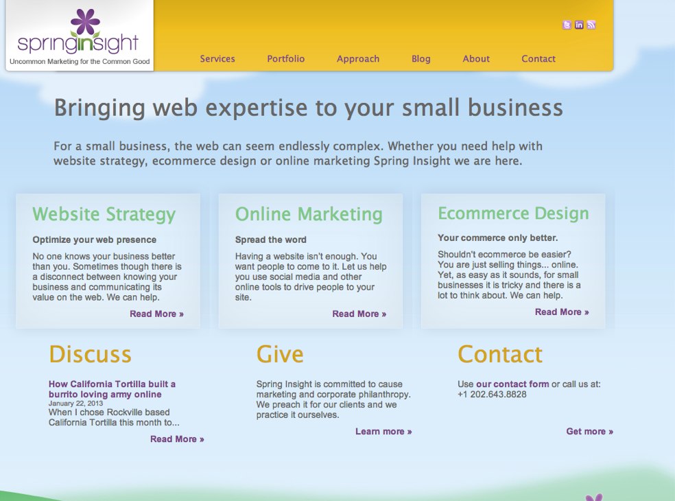
This by far is the most common problem most services companies run into with their homepages. They give an introduction to the company, but they don’t close the deal. There is no easy call to action if I want to move forward with you. I am going to admit to an ugly secret… my homepage (to the left) suffers from this. You love me! You want to work with me! Now what do you do? There isn’t an obvious way to engage me, or at least tell me you are interested, from my home page. Yes, I am in the process of doing a website refresh that will correct that!
 2. They are trying to promote too much
Since we know we capture the most eyeballs on this page we want to promote everything here The problem of course is that the more we have to look at, the less we will notice. Take a look at the site to the left. Despite the fact that they are selling fen shui consulting, do you feel relaxed? How could you in that overwhelming environment
 3. They are trying to promote too little
Every once in while though, I run into a website with exactly the opposite problem. Instead of trying to blow out the page by promoting every aspect of the business, they go with a design that features a more stark design and doesn’t actually give me the information I need to fully understand their product or service let alone make a decision. These sites tend to be highly designed sites that focus more on design than strategy. Any idea what the site on the right sells? Did you guess toothpaste? I didn’t think so.
 4. They aren’t scannable
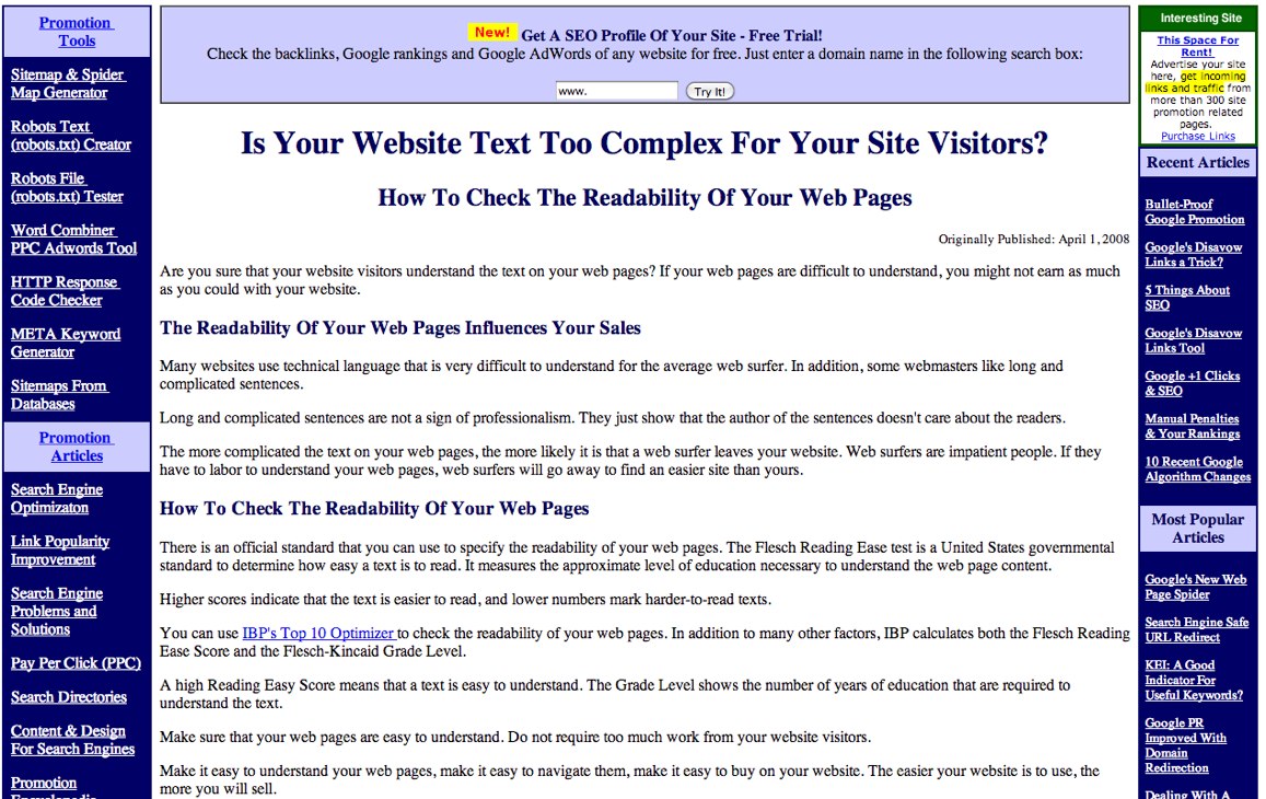
More so than even on paper, people scan websites. If they need to careful read your content to get the gist of your message than you have lost them. How would you feel if you chanced upon the website to the left? I know I feel overwhelmed. Do I want to read through that text to find out what the page is about? Nope, the flight instinct takes over and all I want to do is leave the site, quickly.

 1. They aren’t giving me a next step
 2. They are trying to promote too much
 3. They are trying to promote too little
 4. They aren’t scannable
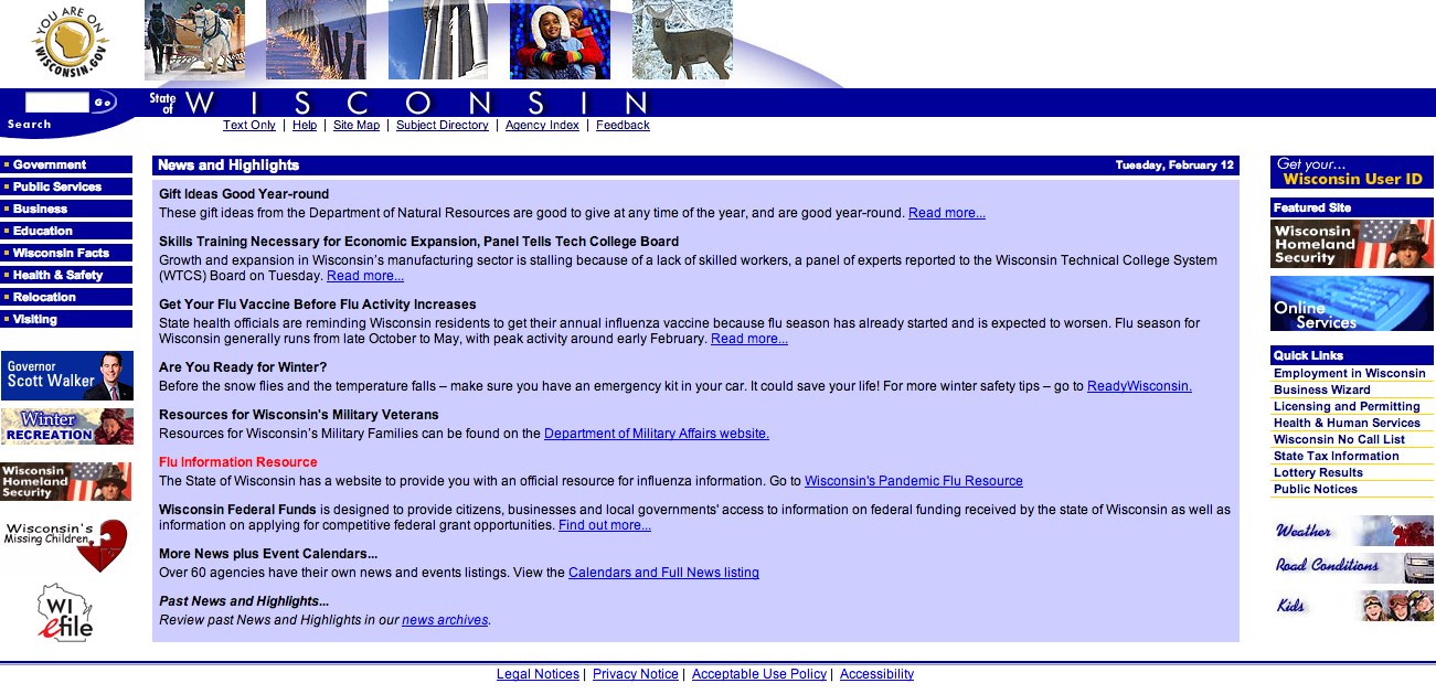 5. They aren’t well organized