Best practices for contact forms – Layout
Continuing the discussion I started a few weeks ago about contact forms, today let’s discuss the layout for these pages.
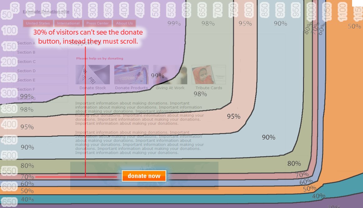 First, as you would with any page, you need to start out by understanding what your visitors can see when they visit your site. Ths sounds easy, but it is actually a little trickier than you think. Personally, I primarily use a 23″ monitor. What I see when I visit sites is completely different than what a typical user is able to see without scrolling. Google has a handy tool that you can find here that cross references pixel size by percentage of people that can see without scrolling. Take a look at the page the tool is displaying, the “Donate Now” button, perhaps the most important botton the page, is located so low on the page that 30% of the visitors won’t see it without scrolling. Know where your elements are and make sure they are easily findable without scanning.
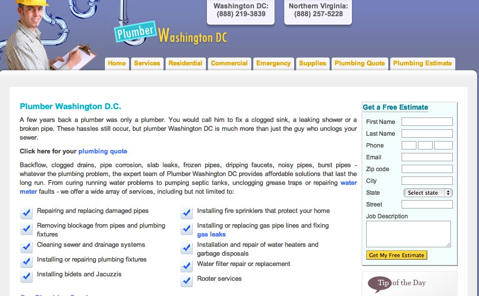 Second, understand the “page fold”. The term above the fold comes from old newspaper days. At that time, the most important news items were put on the top half of the front page of the paper because that is what was viewable when the paper was in a newspaper box. In web parlance, the page fold refers to the part of a website a viewer can see without scrolling. Above we started the conversation about how, unlike a newspaper, where fold lies now can vary tremendously from person to person based on browser. If you looked carefully at the Google browser size model, you know that once you reach a page longer than 550 pixels, 30% of your visitors will be scrolling. While it is important not to hide important elements below that (as demonstrated above) it would be shortsighted to convince yourself that you want to design a page that only goes as long as 550 pixels. The key in these situations is that you need to make sure that important elements start ABOVE the fold. Users can and do scroll, they just need to feel the motivation to do so and to feel that there is value. Take a look at the contact page above. There is quite a bit of text that is below the fold, but the important part, the part where they collect your information starts above the fold in EVERY browser.
When you want a user to take action, the submit or action buttons should be in a color that is just for that purpose. Typical colors are orange, yellow, gold. They stand out and “pop” off the page.
Finally, always include other forms of contact such as phone number, email address or street address. Give your customer the ability to contact you in the way that makes her comfortable.