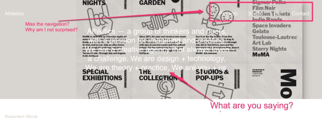
Don’t do that: Text on text
A podcast I like very much (Startup Podcast) promoted Athletics NYC, their web firm, recently. Being the nosy nelly I am, I had to check out the agency website. I hate picking on people in my industry (ok, I am lying, I totally don’t mind picking on people on my industry when they make it this easy.) Let’s take a look at the site I found.
The selection above is the top of the homepage. On the homepage, they have a slider that changes every six seconds or so (not unusual) while the navigation and descriptive language stay static in white font. Take a look what happens when descriptive language goes on top of this infographic? It becomes very difficult to read. The navigation? Well, that is not only difficult to read but very hard to even find. My suspicion is that if I were a fair and balanced website and asked them to comment they would argue the artistic merit and the purity of the design. Thankfully, I am not fair and balanced so I can just point out that design is only as useful as its efficiency to do a job.
Our lesson? If you are going to have a slider that underlies text, you better make sure that that text is always easily readable.

