Ecommerce Best Practices – Primary Navigation
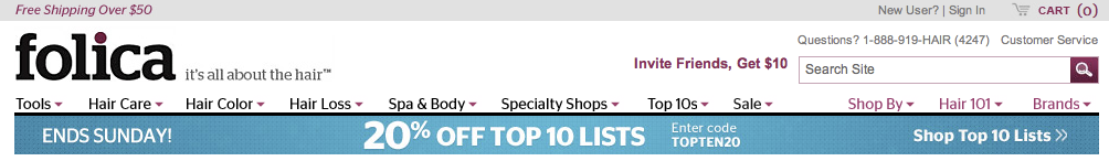
After a bit of a hiatus, I wanted to continue our discussion of ecommerce best practices for each part of the retailer website. As you might recall, so far we have had the series introduction and the home page. Next up, let’s take a look at navigation. In this post I am including six absolute rules plus three nice to haves. I am going to use the Folica header as the first image here because I think they are doing a lot of things right.
The Rules…
Rule #1 – Put your navigation along the top.
Best practice for websites in general is that primary navigation should be along the top or on the left side of the page. Both might be acceptable for most websites but for ecommerce sites, stick to top navigation. The overwhelming majority of sites put the navigation there and therefore that is where customers have been trained to look. This is not the place to be different.
Rule #2 – Your primary navigation should reflect your full inventory
I know this one seems obvious but I still see sites breaking the rule so I will mention it. If the item is for sale on your site, it needs to be navigable from the header. Yes, I know you want to promote some categories over others and perhaps don’t consistently carry a given product or category but you need to figure out a way in your taxonomy to accommodate the random. You don’t want to prevent a sale because you haven’t thought strategically about how to categorize the item. Take a look at the Folica header. Notice that they use very broad categorization “buckets”. It does mean that customers need to drill deeper but it gives them the flexibility to cover a wide territory in the header categories.
Rule #3 – Nothing is prioritized as highly as product
I am so glad that you have great customer service and that you offer amazing free content! That content is essential and we will cover it down the road, but it SHOULD NOT be given the same prominence as product categories. If your site is a shopping site than shopping takes priority.
Rule #4 – Search is in the header and prominent
Thank our overlord Google, your customers search and search a lot. The way to search your inventory should be here and it should be obvious. When I say obvious I mean there should be a box for text, not just the word “search” and there should be a search button. Remember the customer is scanning. And keep the search feature far away from any other input collection that might be confusing. I see a lot of companies put email collection into the header. If the email collection tool looks like the search box (which most do) this will confuse your customers.
Rule #5 – Leave room for the shopping cart
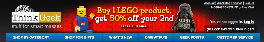
Can you think of anyplace on your site you would like your customer to have an easier time finding than your shopping cart? I didn’t think so. Keep it prominent and put as much information as you can (number of items in the cart, dollar value, etc.) Here is where Folica loses me (to far away, not enough information) so take a look at one of my perennial favorites, Think Geek. Easily viewable in the header… a shopping cart icon, the number of inventory items I have in my cart and the price of the cart items.
 Rule #6 – Keep it compact
 Rule #6 – Keep it compact
Every pixel of your header pushes the actual items on the page lower below the proverbially fold so you really want to keep it compact.
The nice to haves…
1. Room for promotion
When you are having a sale, you want to promote it from the rooftops! The navigation is your rooftop, leave an editable portion that you can use to promote. If you don’t plan to run a promotion all the time make sure you have planned for how it appears when unpopulated. The Think Geek banner has a nice example of built in space which they were using when this image was grabbed to promote Legos. Folica above has a simpler band for content that they are using in this example to promote a 20% off selected inventory sale.
2. You can include multiple brands in a header, but make sure they are clearly delineated
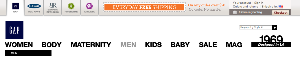
Even small companies sometimes have multiple brands. You can and should link to all of them from your header, but be careful in doing so. Make sure it is clear what is internal site navigation and what takes you to a related brand. I know Gap isn’t a small brand but this is one where can learn from the big guys. Check out how they handle it.
 3. Promote your social media presence
 3. Promote your social media presence
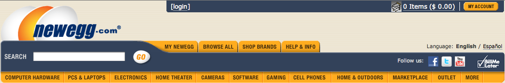
I am putting this as a nice to have because it doesn’t really have to be in the header, many brands prefer the footer but you should have it somewhere that is persistent. Take a look at how New Egg handles it (and enjoy it because you won’t see me use New Egg much as a positive example.)
 Have a great weekend!
~e