Five laws of the ecommerce category page (plus a couple of extra credit items)
I hope you are enjoying your journey through the ecommerce website with me. In case you missed it (how could you miss it? Seriously, is there something more interesting going on in your life?) we have already covered the home page and primary navigation. Next we are headed to the category page.
The rules…
1. Show me products
Take a look at this and see if you see anything missing on the product page below from Restockit.com.
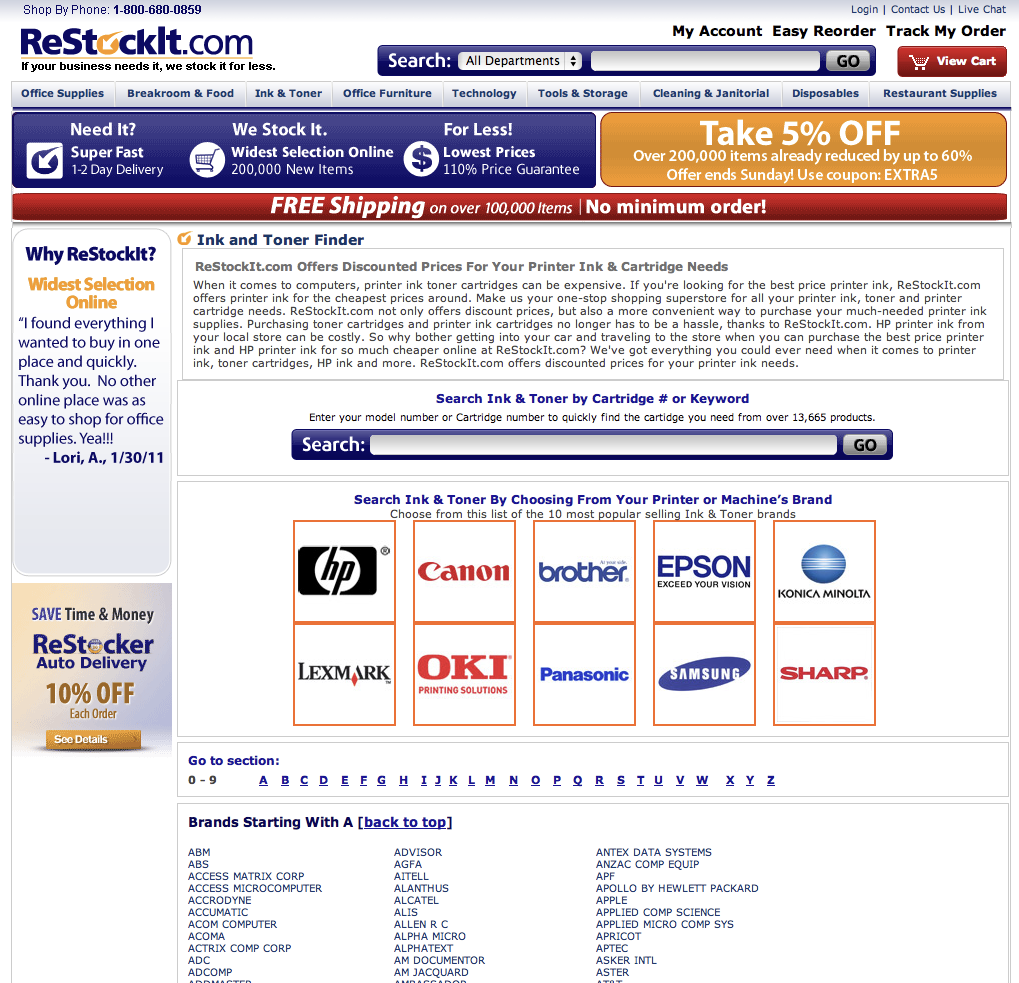 You got it, there are no products on this page. You might be thinking to yourself that I sort of cheated since I didn’t show you the whole long, long, long, page. If you don’t trust me that there are no products, take a look. Why is that bad? Let’s frame in our minds what the category page actually is. It is a signpost for the viewer to where they want to go, the purchase of a product. With no products on a category page, you are giving them a visual cue that there is no end in sight. Just keep going people.
2. Make both images and titles clickable
No image here since it wouldn’t tell you much but have you ever been at a site and decided you liked an item and clicked it… only to sit there confused… until you realized the retailer had made the title clickable but not the image. Don’t be that guy.
3. Keep it tidy
Take a look at this specimen (and yes, I am picking on an Internet Retailer web only top five but they made it really easy here.)
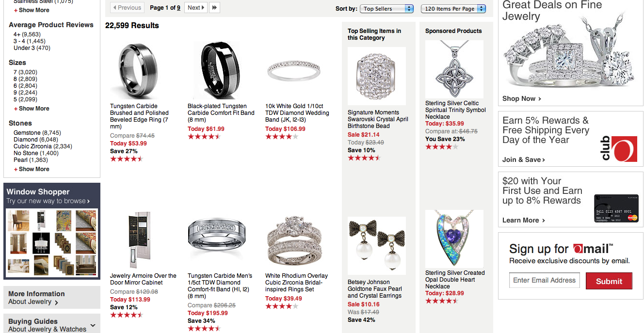 How does it make you feel? Are you engaged? Do you want to keep shopping? Or, do you feel like you just walked into a store in the midst of a sale that looks like a tornado has passed through? Control your visuals.
4. Let me refine
I want to buy a bike for my daughter and I find myself on this Performance Bicycle category page.
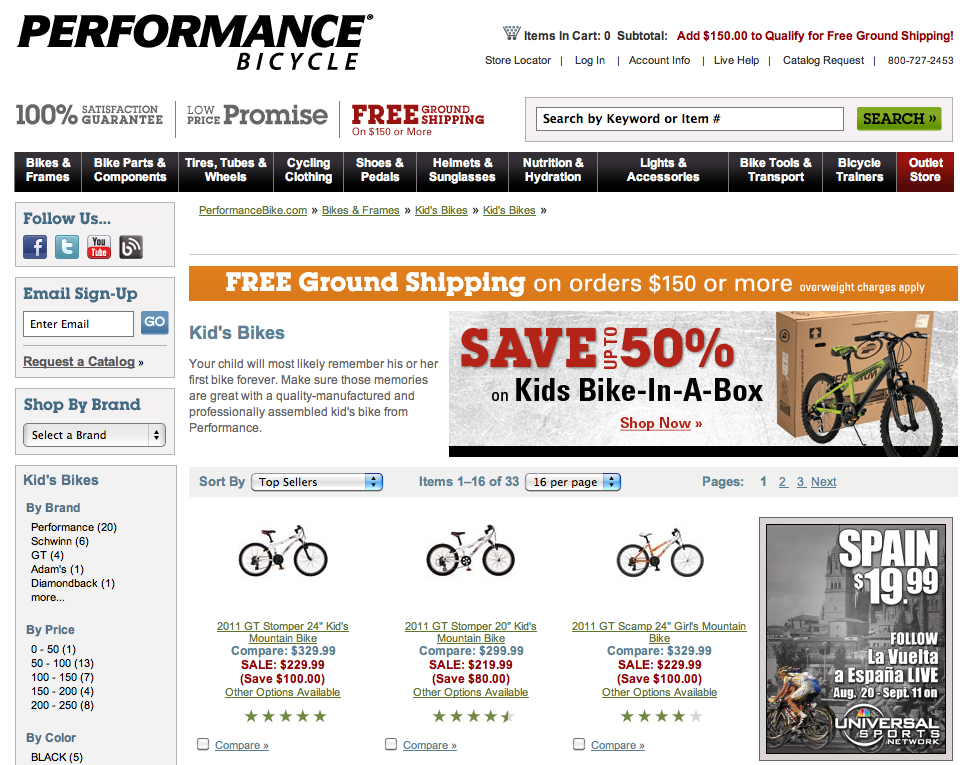 From here I can refine by brand, by price, by color and by size. As your customer, I am not always going to search smartly. Help me get there by showing me what decision attributes I should narrow using.
5. Give me the right information to know my next step
When showing the product, give me the information I need to know before I click. What is most likely to turn me off? Price? Customer review? Condition (if not new)? Whatever it is, put it on the category page. Don’t make me click to find out I have wasted my time.
The nice to haves…
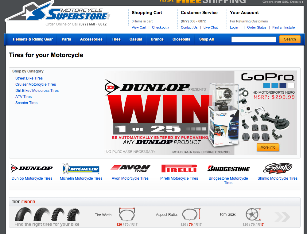
1. Educate me about what I need
As the retailer, you are the expert. Sometimes your customers come in knowing what they are looking for, other times they just have a problem they need to solve. You need to help them do that. Take a look at how Motorcycle Superstore helps its customers find tires.
2. If you can, let me buy it from the category page (with a caveat)
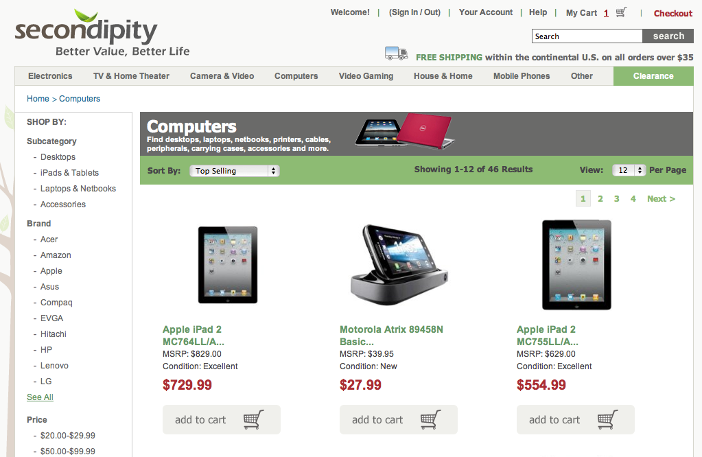
Great, I know right now that I love it and I want to buy it! No need for me to look at it more. Can I buy it from the category page? I can at smart retailers. One caveat to this is that this only works if you show me all of the information I need on the category pages. If the product has surprises that might dissuade me from buying, tell me before I do so. If you don’t, I will be your customer service departments nightmare. Check out this category page on Secondipity (those that have read other parts of my site know Secondipity was my baby), I can buy from the category page but only after they tell me the condition since their items are not all new.
I think next week we will sink our teeth into what I consider the most important page on the site, the product page.
Have a great weekend!
~e
It’s an remarkable article for all the online users; they will get benefit from it I am
sure.