Last week’s post on net neutrality was quite the conversation piece. Many people shared the post on Facebook and Twitter, and the version that went up on Huffington Post launched a lively debate on the pros and cons of this important policy issue.
What nearly upstaged the debate, though, were the nifty infographics that went with the blog. I almost hate to reveal this tool that I love, since it makes me feel like Michaelangelo, but I must give credit where it’s due. Besides, I love this tool so much I can’t help talking about it.
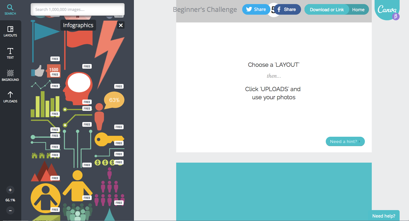
The awesome graphics come from an application called Canva.
So, why do I love Canva?
1. It’s easy to use and intuitive.
2. There are lots of options for a wide variety of visual elements, so it’s easy to customize to your specific needs.
3. Most to the time it is free, and when it isn’t, it is very cheap. I used paid elements on the Net Neutrality blog post and it cost $3.
4. It’s a great way to avoid one of my pet peeves―stock art―and the images can be used on any post on any site
5. It’s quick.
6. It comes pre-stocked with tools to use to create infographics that allow you to express ideas in pictures instead of just words, which is essential to keeping your blog lively.
Give it a spin and report back on what you thought!
Curious about any particular tools you would like me to discuss? Let me know by email or in the comments below.
~e