Don’t Do That: 7 deadly sins websites still commit

Don't let your website end up here.
-
-
You don't invite me in - I have heard the analogy from time to time that the homepage of your site is like a front door. That means you need to invite me in. You need to provide links from your homepage into your content. Want to tell me how great I will look if I use your service? Link me to a page that shows me samples. Want me to hear more about your approach to business? Link me to a page with details.
Some business owners think the primary navigation is enough; it isn't. If you want me to interact with your site, your homepage content needs to compel me to enter your website. I don't want to have to hunt the navigation and guess where to go to find the details I need.
Sliders tend to habitually commit this sin. The imagery is lovely, and perhaps it sets the right tone for the website, but unless you build in a button or other call to action, a slider takes up vast expanses of space that don't invite me into your site.
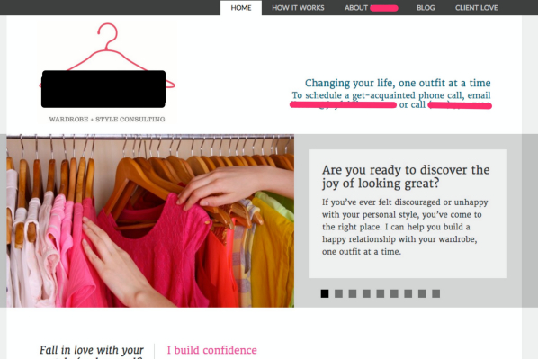
Take a look at a website I found: lovely imagery, paragraphs of informative text, but nowhere am I invited to come in further and learn more.

-
You're using your language and not my language - Are you using cutesy language? Are you using industry jargon? Are you describing your solutions instead of my problems? Then you are doing it wrong.
Every website solves a problem. I see that problem in my terms. Take a look at the sample below from an ecommerce site. This site is for a company that makes accessories for therapeutic footwear. But how do I know what these terms refer to? What does "Wrap-It" mean? (wrap what?) It turns that out this refers to a cuff you can wrap around your medical boot, but you would never know it from looking at the top navigation bar. These terms are cute, but they tell me nothing.

-

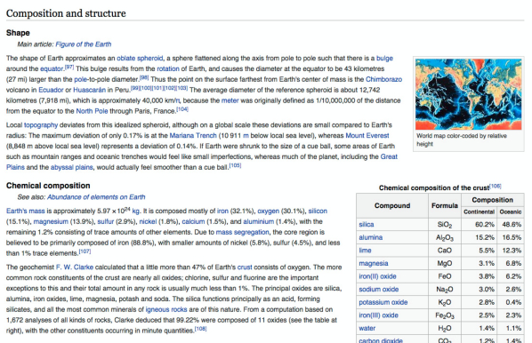
- You make me read too much - Content for the web is different. Don't expect visitors to carefully read it; instead, it needs to be easily scannable. That doesn't mean you can't get into detail, but you just need to arrange it so that people can find the detail they want and scan through the rest.Take a look at how Wikipedia solves this. A topic like "Earth" is a dense one with so much to tell, but by use of links to further information, subject headers, tables, and imagery it is far more manageable.
 It also needs to incorporate appealing video and graphics. Traveling across the web is meant to be a multimedia experience. I want to be able to quickly scan your website to get to know you and then have different ways to learn more.
 It also needs to incorporate appealing video and graphics. Traveling across the web is meant to be a multimedia experience. I want to be able to quickly scan your website to get to know you and then have different ways to learn more.
-
You break my expectation as a visitor - You know what I hate? I hate when I go to a website and I have to think, whether it is because you have put your navigation in a weird place (bottom left, really) or you take me to a page on the primary navigation and then change the template and everything looks different. Every website that a person has ever been to before yours has trained her to deal with your website.
In other words, visitors arrive at your site expecting it to conform to certain conventions, whether they are conscious of this or not. It is ok to be creative but, simply put, there are some "rules of the road." Certain items go in certain places. If your visitors don't find those items where they expect to they will quickly become frustrated. Does this mean that your site can't be creative? Heavens no! You can absolutely be creative, but that creativity just needs to be consistent with the way your visitor knows how to traverse the worldwide web.
Your site should have some internal logic and consistency. For example, the basic environment of your site (layout, color scheme, fonts) must be consistent throughout the site. If I arrive at a particular page that radically departs from the overall feel of the site, I will be lost and confused. Don't make me lost and confused.
-
I can't find what I am looking for―Test your navigation on others to make sure they can find what they need. Don't just ask them if the site is easy to navigate. Give them specific tasks, and if they cannot accomplish them from the cues on the site―no coaching―you need to rethink your navigation. (This can be delicate. Make sure your testers know that it is your site and not their intelligence that is being tested.)
Although it is no substitute for good navigation, a search box can be helpful. But, if you are planning to have search, do your research and get a good search plugin that displays the results well. I can't tell you how frustrating it can be to do a search and get results that are meaningless or incomplete.
-
You don't actually ask for my business in the right place - I am at your site! I just finished reading your content, and now I love you! I want to be your customer! Now what? What is my next step? How do I hire you? Do I call you? Do I fill out a form? Some businesses get shy about this. They put up a contact page, but that is it. On every other page there is information selling me on the organization, but no close. If you want me to take the next step, ask me to. Give me a good reason to. "Call now so we can solve your issue." Now is not the time to get shy.
-
You play sound - I know of a catering company that starts playing music as soon as I arrive. I cringe whenever I visit. I think about who might be visiting them. Picture this: a bride-to-be is attending an all hands staff meeting. She is bored by the seventh speaker in a row talking about synergies, so she decides to multitask by using her computer to research catering for her upcoming event. Her innocent little distraction is about become a serious embarrassment when her computer starts blaring music that was unbidden. Never create a situation for me that I didn't ask for. Not by playing a video I didn't start, and not by pushing out sound. When I go to your website, I am only inviting the site, not sound.
-
(ok, slipping in an 8th) Flash - Seriously, Steve Jobs declared war on Flash in April 2010. That was FIVE YEARS ago. For five years, Apple devices that use the iOS operating system have become increasingly popular. Every year the amount of traffic that comes from mobile (for all age groups) just increases. A site with Flash is a site that has decided that it is ok to appear broken and slow to sites using mobile.
photo credit: Afterlife Stinks via photopin (license)
~e