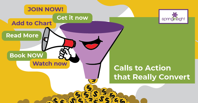
Calls to Action that Really Convert
As web developers, we have a special place in our hearts for the design side of website building. Nothing gets us giddier than creating a site that is both beautiful and aligned with our client’s brand and image. But, we also know that your website has a job to do and must be fully functional, too.
This month, Spring Insight is writing up a series of articles aimed at getting the most out of your website. Specifically, we want to see you finish your year strong, and Q3 is the perfect time to set yourself up for year-end success. So with that goal in mind, let’s get back to your head-turning website.
In the first installment of the series, we got into how a business owner can directly impact the number of people who visit their website. No matter how beautiful your website is and how hard you work at channeling people towards it, what happens when visitors land on your site matters, too.
This second article in the series will guide you through increasing the conversion rate on your website, turning more visitors into paying customers.
Missing a Call to Action Means a Missed Opportunity
The single biggest thing we notice when we are working with business owners on reworking their websites is that most of them do not provide an obvious and clear way for visitors to provide their contact information. These are your website’s calls to action, and they have to be clear and easily accessible.
Why would you want that? Because this is how you discover who is interested in what you are offering and the means by which you are able to follow up with them to move that customer from just interested to buying. This is how you tell the potential client what they should do next.
Common Examples of Calls to Action
A clear call to action should be incorporated into every piece of content on your site as well as just about every single page. Common call to action examples include:
- Join an email list or newsletter list
- Get access to a free resource or value-add
- Schedule a consultation or call for more information
- Downloads that are pertinent to your business’s service offering
Call to Action Best Practices
Whatever call to action (CTA) you choose to include, it should be prominently displayed and be super easy to use. You do not want people to have to click through seven pages and provide their mother’s zodiac sign and their kid’s blood type in order to get the freebie you offered. A good rule of thumb is to shoot for one click with one space for an email address. That’s really ALL you need to move forward.
If you want to get snazzy, we feel you! There are some special things you can do to add some spice to your call to action. Best of all? These methods have been proven to be highly effective and engaging.
- Use action words like “join,” “click,” or “download.”
- Insert a time element to initiate a sense of urgency
- Use a contrasting color for your CTA button
- Get fancy with your button shape
- Go big or go home: no small, hidden CTA buttons
- Keep the copy short and simple, not long and drawn out
- Place it “above the fold” so no scrolling is needed to see it
Choosing (or Losing) Your Call to Action
Any call to action that you incorporate into your website should be tested for effectiveness. If it works, let it live! If it is limping along and not serving your business with a steady stream of leads that you can convert, it’s time to toss it. Play around and see what resonates with your audience. Offer new freebies periodically to re-spark interest from someone who likes what you are doing but hasn’t yet taken the plunge to buy what you offer.
Guess what? It is time for this blog post to end with a super strong call to action! If you think your business website could use a fresh set of eyes, we have something for you. We offer a FREE AUDIT of your website that will look at your CTAs and more. All you have to do is click here to schedule your free audit today. (And yes, it is prominently displayed on our front page, above the fold, in contrasting colors.)
The next article in our “finishing strong” series will give you all the deets you need to know about Google’s GA4 conversion. Don’t know what that is? Don’t bother Googling it. Just stay tuned, and we will fill you in.
