The Business of the Brain on the Internet: The Luxury Effect
Picture yourself in a store. The store has racks and racks of clothes. Not only are the racks close together, but also the clothes are tightly packed on the racks. There are literally thousands of items to select from.
Ok, now picture yourself in a second store. This store also sells clothing, but there are far fewer 
If you crack your wallet at both of the stores, which one do you think will leave your wallet lighter? You aren’t simple, so you know where I’m going with this. The second store is likely to be far more expensive and you will likely spend much more money there.
It is odd when you think about it. There are so many more options in the first store! You will find a myriad of choices that fit you and look good! Shouldn’t it be the case that you spend more money at the place with more options?
Nope. Meet the luxury effect.
This month, we continue delving into psychological tips and tricks for making your website better exploring the luxury effect (or how to use negative space to charge more.)
Ok first, what is negative space?
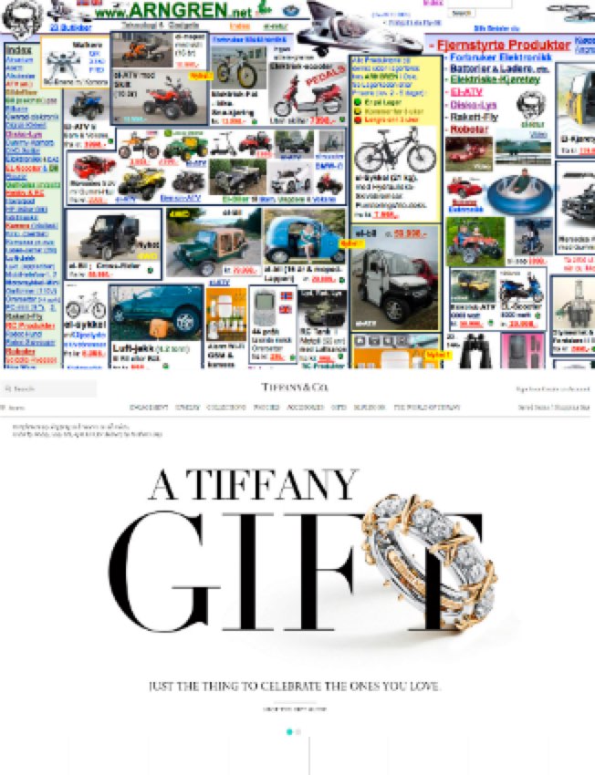
Negative space (sometimes called white space) is the space in between elements on a website. It is the online version of the space between the racks or the number of shirts on each rack. Believe it or not, it is the space that draws the eye to specific products.
Take a look at two websites, Arngren and Tiffany. One clearly does not embrace the idea of 
Now, how can you use this principle to improve your website?
Comfort + Relevance = Focus
Ever had difficulty focusing in a cluttered or crowded space? That’s because aside from creating a perception of sophistication and elegance, negative space also provides us with a sense of psychological relief and comfort. And when we feel at ease, it’s easier to focus. But when we’re browsing websites, we are also laser-focused on finding information that’s relevant to us. So how do you grab your users’ attention?
Think about the images on your website. Do they project a feeling of freedom and comfort? Avoid cramming images together like photos in a collage. Instead leave plenty of space around images. One designer suggests imagining putting a crowded webpage on a balloon and blowing it up to create healthy gaps between elements.
Are your images inadvertently blocking users from seeing your content? Also, keep in mind that users instinctively avoid looking at any images or graphics they take to be irrelevant. This means that stock photos are attention killers (yet another reason I hate stock photography) because most people assume images of models or generic pictures are advertisements so their eyes jump right over them. If you have these kinds of ‘place-holding’ images near important content, you risk users missing exactly what you want them to pay attention to.
Rephrase + Reformat = Remember
What if I told you, you could get users to remember about 34% more, while spending half as much time engaging with your content? Sounds pretty good, right? That’s exactly what one eye-tracking study showed. Simply presenting text using
- bullet points,
- subheadings,
- paragraph breaks,
- and tight copy
allows users to quickly scan for information they can use. Also, research comparing reading performance using four different white space layouts showed that margins and leading (space between lines) influenced both comprehension and user preference. So rephrase and reformat any big blocks of text on your website.
Bonus round: Consider basic typography
A subtler element of negative space that is easily overlooked has to do with font style and size. Just as margins around blocks of text and the space between lines can make websites easier to read and comprehend, space between letters makes a difference too. Of course, you don’t need to go to design school and learn about serifs and calligraphy in order to consider basic elements of typography. Here are some simple tips to keep in mind:
- Keep the number of different fonts to a minimum. Using multiple fonts decreases readability.
- Make sure your text scales well (to test your site, simply zoom in and out on your browser).
- Consider the weight of the fonts you use. A font’s weight is how thick it is. Change weight to highlight important ideas like headlines.
So what?
Now that we’ve established that when it comes to getting website users to focus and remember, negative space is nearly as important as content, so what? What’s the bottom line? Well, just think about what your website does for your business. Your website presents your brand to the world, controls your company’s public image, and wins over more customers (even while you’re asleep). In other words, websites are all about creating the right perception for your audience.
Here’s the bottom line: Create the perception of luxury, comfort, and value and you’ll be able to charge for luxury, comfort, and value (and if you don’t believe me, just consider the most recent earnings report showing Tiffany & Co’s stock grew 92% over the past year!).
There’s simply no denying the power of the luxury effect.
