We went out to weed the garden a bit and ended up replanting the whole garden!
At Spring Insight, we love spring (as if you couldn’t tell from the flowers blooming all over our 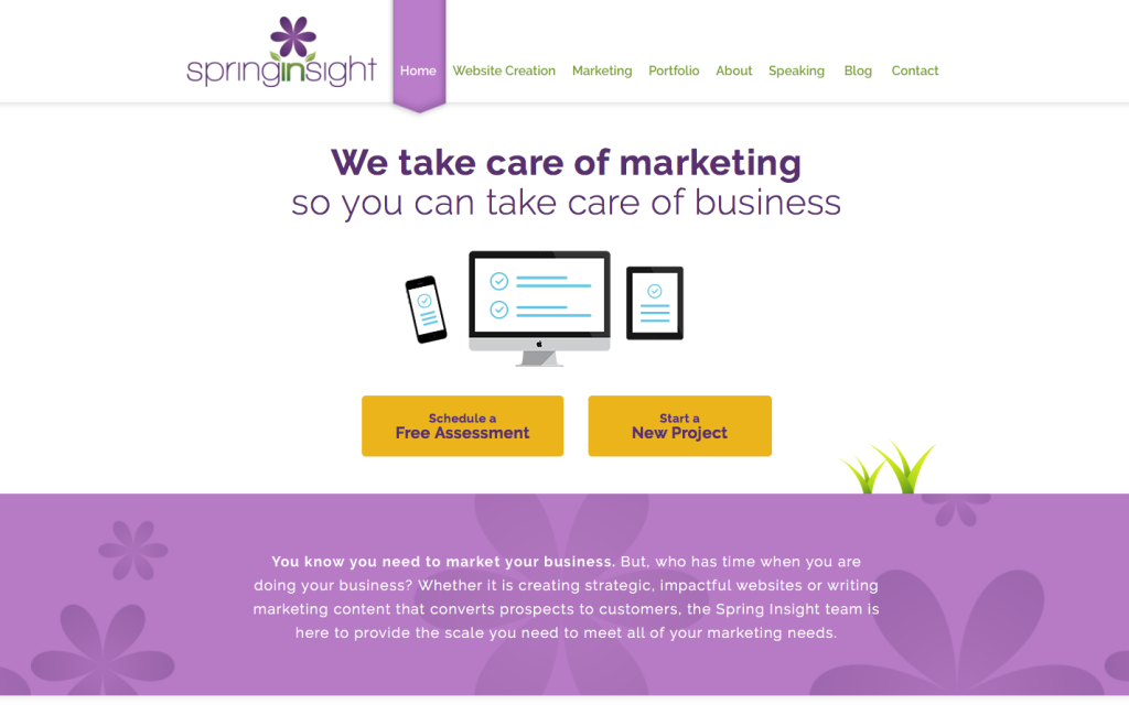 website)!
Spring is the season of rebirth. Dormant seeds wake up from their deep winter slumber, shake off their blankets of snow, and push their heads up through the damp soil ready to burst into full bloom. But of course, rebirth doesn’t necessarily mean starting completely from scratch. You wouldn’t cut down and replant the trees in your yard every spring; still, there’s nothing wrong with getting out the trimmers and doing a little pruning.
Sometimes a little pruning is just what a website needs too. I talk to clients all the time who are hesitant to take on a total website overhaul and so I recommend simpler changes that quickly make their websites more functional, sleek, and engaging.
At other times, a little pruning turns into a full-blown slash and burn (in a good way). Actually, this is what recently happened with Spring Insight’s website. I set out with a plan for a website refresh and ended up with a total redo. I couldn’t be happier with the results.
Take a look at our new and improved website!
Now, what are the changes that make the most difference?
- Cleaner, easier to use: The new site is cleaner and it’s easier for users to find what they need quickly. We removed the banners on the main page that, rather than drawing readers’ attention, caused readers who were skimming the website to skip past important action items. The new simpler style automatically draws your eye down the page and toward action items. The new style also makes the page friendlier to mobile users.
- More compelling calls to action: All of the buttons for different action items are easy to see (I just love that maize color next to the Spring Insight purple, don’t you?). And each action is clearly spelled out, not only with words, but also with matching graphics. The computer screen, tablet, and cell phone graphics on interior pages call back to the main page making the website appear more cohesive too.
- Better highlights the work we do: The new website wireframe features separate pages for web creation and marketing services. This not only helps users to navigate directly to the services they are looking for more quickly, but it also gives us better opportunity to highlight the fabulous work we do on each side of the business. Each page has its own header containing a unique value proposition, which naturally reminds the user why she’s here.
- More information about what working with us looks like: When used effectively, visuals are more compelling than text. That means any time you can use graphics to clearly depict a process you want your users to better understand, do it! On the older site, we used this tool to explain our web creation process. The flower sprouting from a pot is memorable and a perfect metaphor for the work we do at Spring Insight (so you know we’re bringing it along to the new site). In addition to the flower sprouting, on the new site we’ve added a getting started page that makes the whole process of working with Spring Insight from start to finish (or in an on-going capacity) more transparent.
If you are a regular visitor, you have probably already noticed some of the biggest changes. To celebrate the big announcement, we’re running a little contest. Call it a belated Easter Egg Hunt. To get in on this, just go to the home page, count the number of flowers, and post in the comments below. I’ll choose someone to receive a free Spring Insight picnic basket.
As you can see, I’ve been working hard to beautify my online garden. Now I’m ready to sit back and relax with a tall glass of lemonade (yeah right). How about you? Are you ready to sharpen your hedge trimmers with Spring Insight? We would love to schedule your Free Assessment or help you get started on a New Project?