Web Trends I am seeing and NOT LOVING in 2015
Last week, I praised some web trends that I’m loving this year. But like wearing leggings as pants, some web trends just need to go away.
And now, for the bad news—What I don’t like:

It seriously keeps going and going and going….
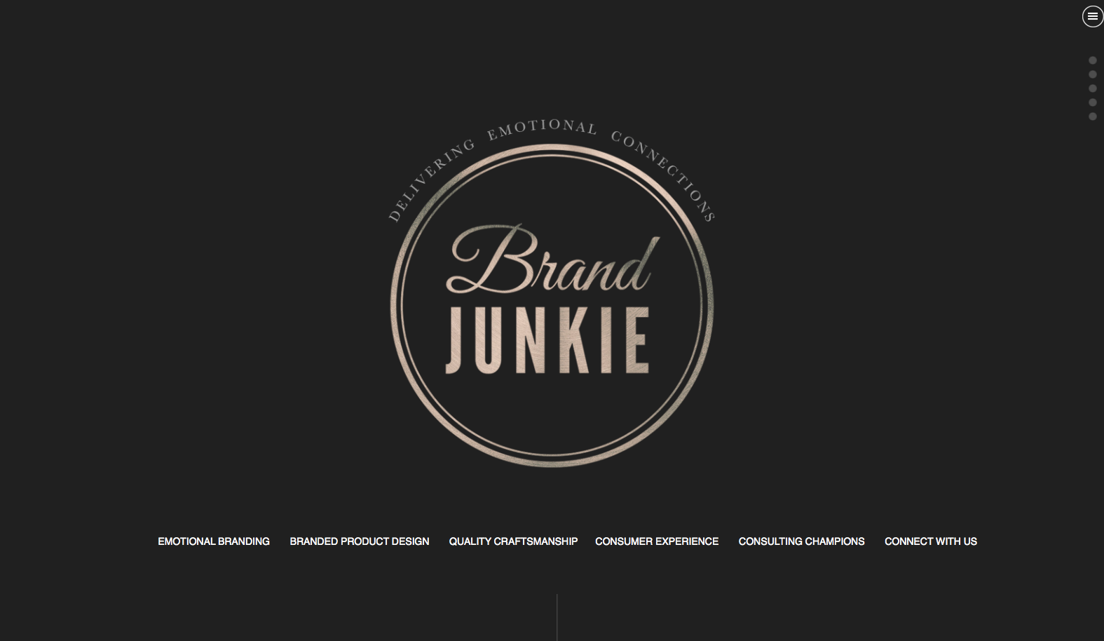
1. Huge long pages that scroll and scroll for no apparent reason: Some call it the death scroll, others the bottomless pit, but whatever you want to call it, we can all agree that it’s irritating. The genesis of these sites is the one-page site where you scroll and scroll to get to new sections, but now I am seeing more modern sites doing it even when they have multiple pages. Much of the time the pages are created with super huge elements that push content down too far. See the example to the left…
Sites like this challenge me. Mainly because so much content gets pushed low on the page that it’s easily overlooked. Or if I’m scrolling to find something specific, I miss the button I’m looking for because I’m scrolling too fast to get by the stuff that doesn’t matter to me.
2. Navigation drawers: I am seeing the little three-lined navigation button (You know, the menu button that looks like a hamburger) appear more and more on homepages.
This trend started as a space-saving solution for mobile apps, but I often see this used for full websites on large displays as well. The thought behind this is the designer wants to use every pixel of space to create an impactful image, without the distraction of all that other stuff. But that “other stuff” is the navigation. It’s the information about who you are, why I should trust you, what makes your business unique, etc. That “other stuff” is EVERYTHING to your business.
3. Hidden menus: Another trend I’ve been noticing is hidden navigation menus that only appear when you mouse over a certain ‘secret’ area of the site, like below.
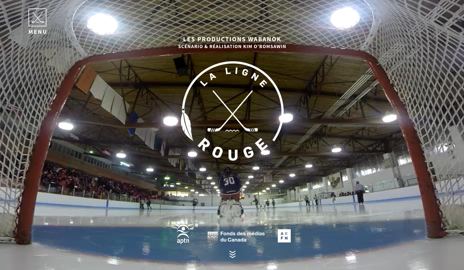

(But La Linge Rouge is not all bad. We do need to give them partial credit, since they feature a girl goalie and we know Spring Insight has a special affinity for women in hockey.) Using a website shouldn’t be hard. It shouldn’t take thought. And navigating your site definitely shouldn’t require users to go on a treasure hunt. If you want people to stay on your site and find what you are offering, put everything where they expect to find it.
When it comes to web (and fashion) trends, the spotlight should be on the user. The best approach is to insist upon designs that are high quality, professional, and, above all, functional.